How to make people think you have a graphic designer on call
Welcome to your graphics 101 class!
In this blog, I am going to share what actually makes a graphic feel *premium and professional* - whether it’s a social tile, web page, flyer etc.
These are common visual mistakes I see a lot of DIY queens making and what to do instead. Easy, actionable and sure to ACTUALLY elevate your designs. I’m going to use a graphic template I found on Canva and literally show you how to elevate it - so you can make your own graphics feel like they came straight from a designer.
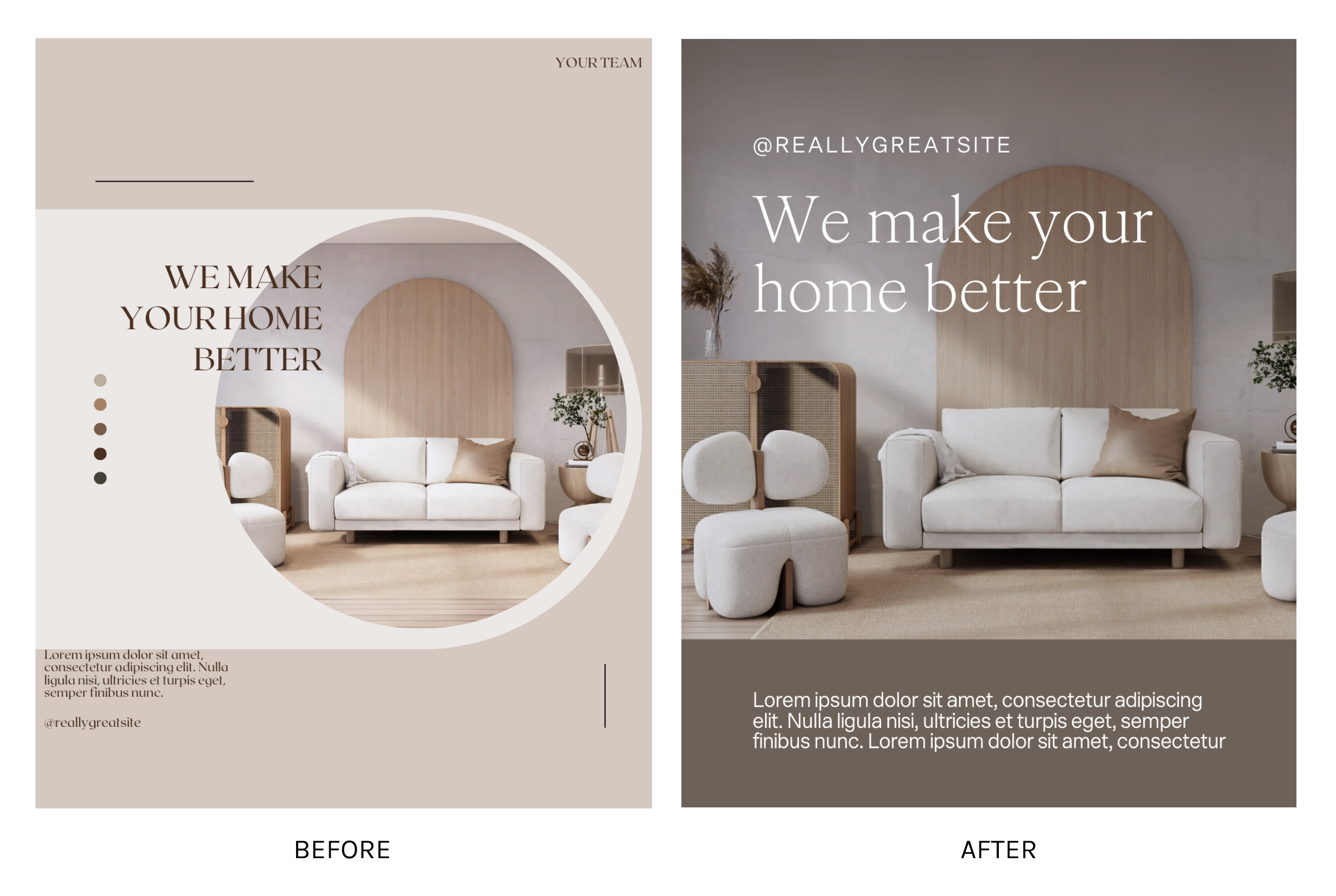
Okay here is our before and after….
And here are the tips you can implement today:
1. Keep it simple, too many elements feel messy.
Often it can feel like by adding ‘more’ you are making something feel more designed. But it’s actually the opposite. Like in our Canva example there are way too many many competing elements that aren’t adding anything making the design feel messy and busy.
Some elements are good for the vibe but as a general rule keep it clean.
2. Legibility, legibility, legibility
Don’t put logos/ text over imagery with busy backgrounds or colouring that is too similar to the actual colour of the element.
If people can’t easily read it, it’s going to feel unprofessional.
Instead, toggle the image to find some ‘white space’. If there is an image you really want to use but feels busy you can head into adjustments on Canva and edit the brightness (lower if you want to use a light coloured text/logo and higher if you are using dark coloured text/logo).
You can use the background extender tool on canvas or the eraser tool to actually create more of this ‘white space’ depending on the image. Use this with judgement though as this AI is still learning - don’t go ahead if it looks freaky.
If you are using a plain background, consider altering the colours for higher contrast and more readability.
3. Increase your margins around ALL elements.
Spaciousness is so important when it comes to making a design feel premium.
Make sure your elements aren’t too close to the edge of your design or to each other. And definitely make sure nothing is getting cropped off!
4. Use clean font choices
Okay this kinda circles back to legibility but scratch any fonts that may be hard to read like a script font. You can use a ‘personality’ or more detailed font for your heading but as a general rule keep paragraphs as a super easy-to-read font otherwise, people just won’t try.
Also don’t overuse capitals especially for headings and don’t over space the distance between letters on body copy.
If it was illegal to info dump - arrest me! I hope this is helpful and please let me know if you implement any of these.
Steph x


