So you booked the Monday Makeover Package…
What does a full rebrand actually look like
Okay if you’re anything like me, you would love a visual. I thought it would be fun to show you guys a full breakdown of what I popped together for this client's Monday Makeover package. This is my full brand and web design package. All inclusive, aligned, impactful branding delivered across a range of touchpoints.
So, what’s actually included in the Monday Makeover?
Primary Logo
This is the main logo for the brand. We went with a design that felt warm, safe and approachable. I created this in every brand colour on every brand colour background.
Secondary Logo
This is a version of the primary logo better suited for a horizontal space. This means the brand never has to crop, squash or stretch their logo because they have versions that work well in different spaces.
Brandmark
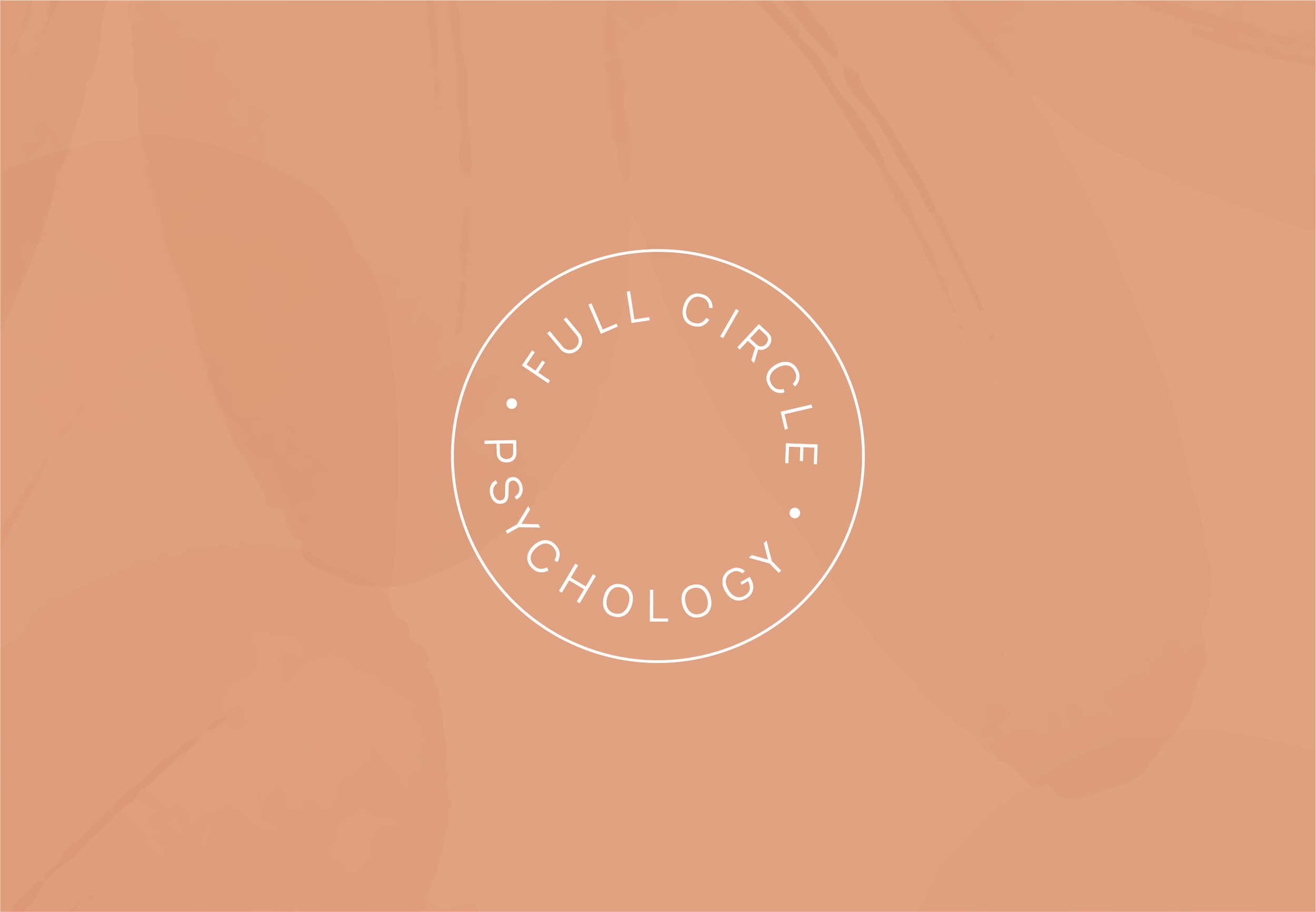
For the brandmark we went for a classic stamp style. This is perfect to be used in a website footer or to integrate a splash of brand personality when space is limited.
Typography
Full typography suite including brand-aligned heading, subheading, body copy and brand script font. I also included detailed notes on styling and usage.
Colour Palette
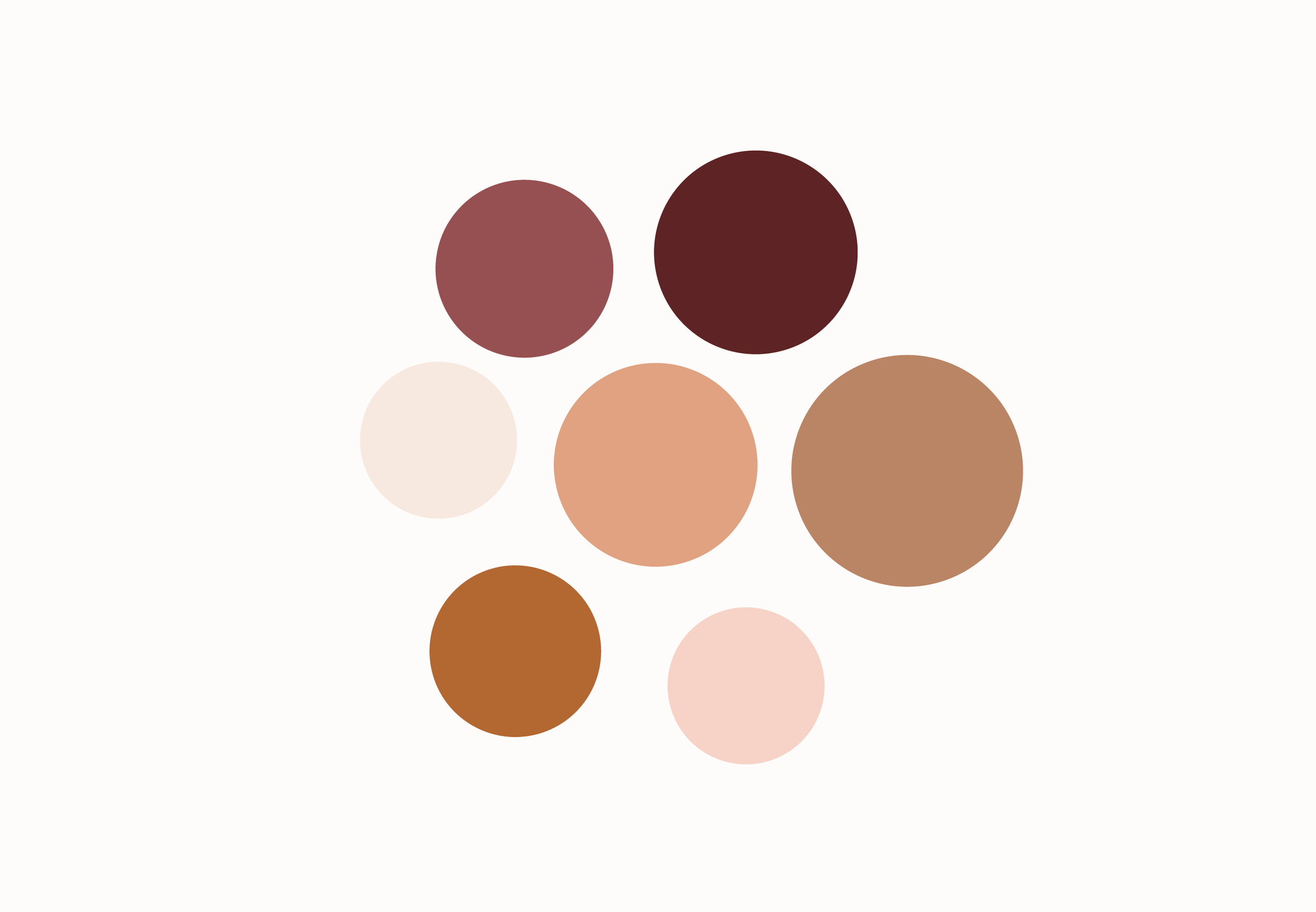
These are tones and shades that give the brand a warm, safe and approachable feeling. The colours have different purposes in the palette which creates dimension.
Custom Illustrations
We created a full illustration suite in a relaxed style with custom designs that can be used across the brands socials and website.
A full six-page website
We paired the branding with a full six-page Squarespace branding to create a digital space where potential clients could inquire and learn more about the brand.
Brand Assets
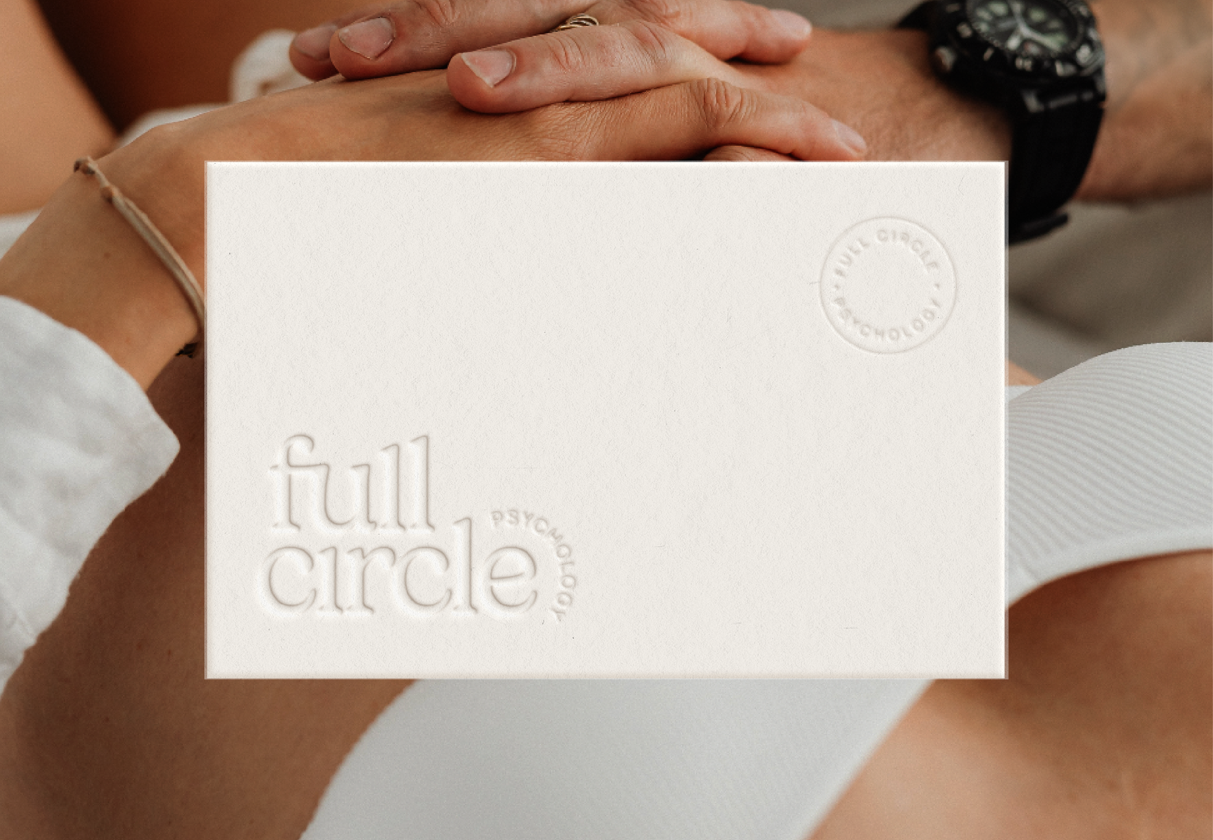
Of course we had to include these staple brand stationary pieces. It’s so nice when a brand can seamlessly show up across all customer touchpoints from digital to physical.
Social Media Templates
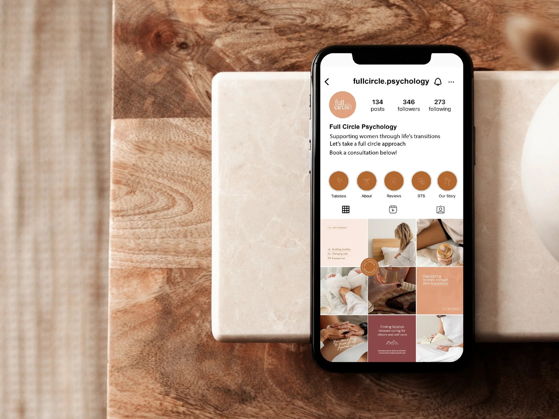
With this brand package the client received a collection of brand aligned custom templates in different sizes perfect for stories, reel covers and feedposts. I also formatted graphics for highlight covers and profile pics.
Stock Imagery
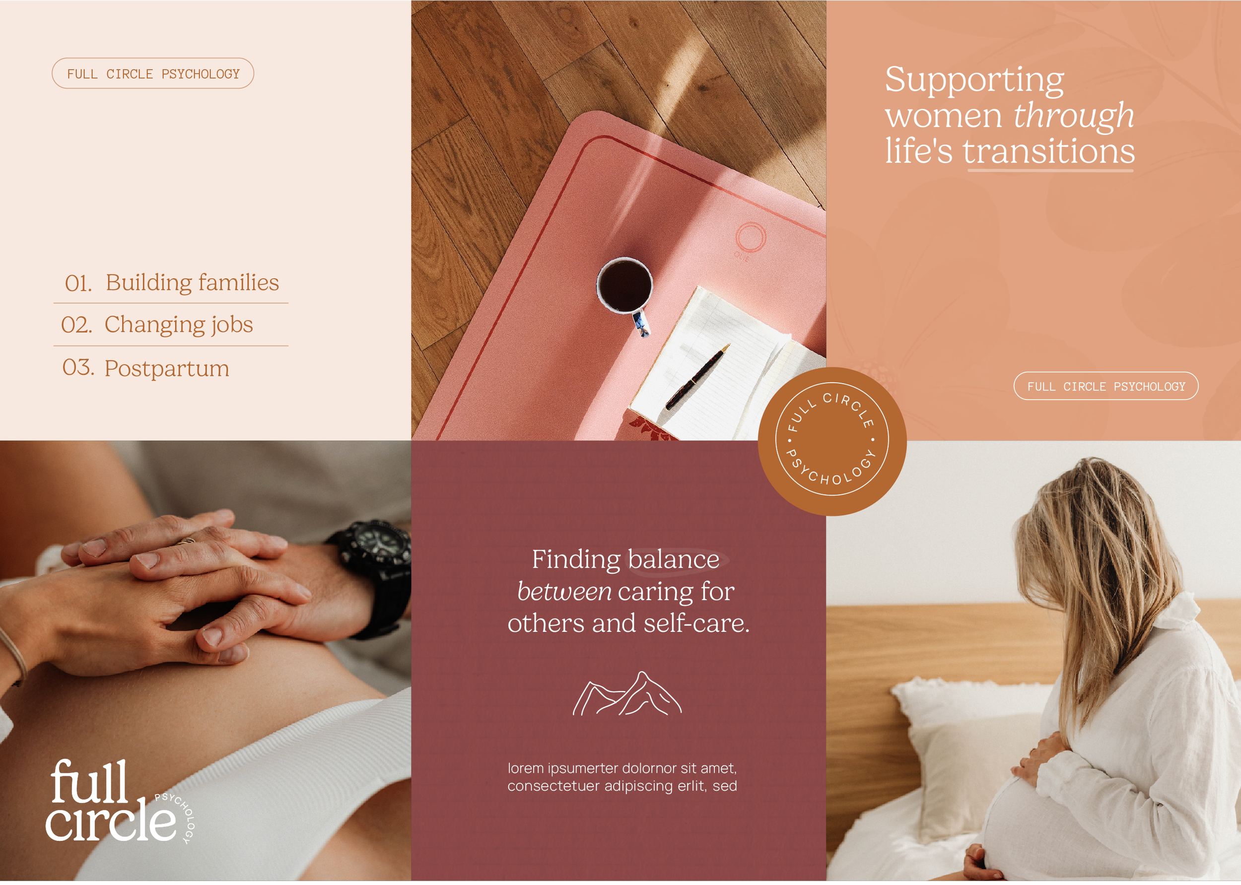
I sourced a range of aligned stock images for the brand to use across socials and web so there is a collection of options to reach for while the brand doesn’t have custom imagery yet.
Textures
I had to include two bespoke textures. These elevate any social post and were perfect
across the brands website backgrounds to make things feel more custom and unique.
Detailed styling guidance
As a brand designer and strategist it’s super important to me that the brands I build have a clear and defined style, this is basically the language around how your fonts, colours and logos are actually used.
Mockups to show digital vs print
I love to include a range of mockups showing how the branding comes to life. This is super helpful for clients to get a feeling of how their brand would exist in real life.
Brand Guidelines
This is an extensive 40-page detailed breakdown of how to use all of these elements with extra support around styling and usage.
If you have any questions, reach out! My inbox is always open. Let’s build aligned and impactful brands together.

