
Case Study: The Body Image Coach
There is no such thing as a strong brand without a strategy.

Every brand I build is deeply rooted in strategy - at Studio Monday, everything is extremely intentional, leveraging a business's brand to connect to its personality and dream clients. In this blog post, I want to share a wee bit behind the scenes of how this actually looks when working with a client.
The client:
The Body Image Coach is a community on a mission to create an experience for women and girls to overcome negative body image and rebuild their identity as a person they love and are proud of.

The brief:
We wanted to create something that felt strong and empowering. We wanted the brand to feel inspiring and confident, with a hint of unapologetic sass. The brand was designed to feel elevated and high-energy, while also being approachable and inclusive—a space women want to be a part of.
Colour Pallette:
We utilised these beautiful, strong, bold colours to bring through feelings of confidence, sass and empowerment. We paired these with gentle, soft, warm tones to create some balance across the brand and touch on the different energies at play.

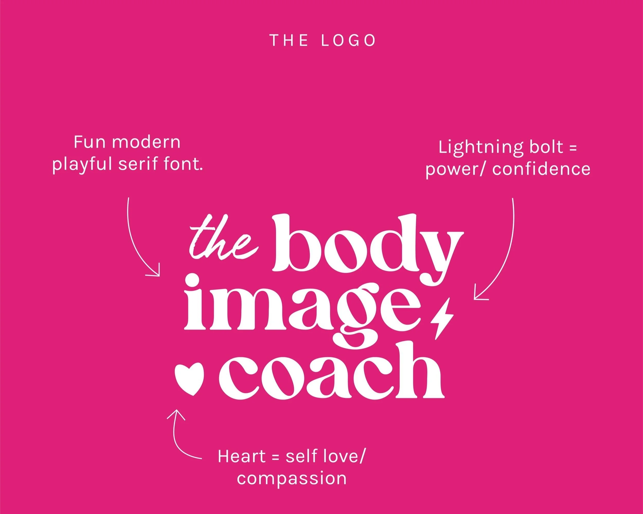
Logo:
For the logo, we wanted to integrate something that captured the confidence, whilst also the empathy/softness of the brand. Hence why we integrated a lightning bolt and heart to reference both of these things. We then chose a friendly, modern font to make the brand feel really appealing.
Brandmark:
With the brand mark, we wanted a simple, iconic symbol to capture the essence of the brand. Referencing the lightning bolt and heart in the logo and combining them here was a beautiful representation of Jordy's work, promoting self-love and confidence.

Fonts:
I love a script font for bringing through a sense of connection and conversation. We chose this option to feel like a note written between friends. When we pair this with the clean, legible copy font and the fun, modern heading font, there is a beautiful dynamic feeling throughout the brand's typography.

Assets:
We built out this collection of core empowering phrases to be spread across the brand, strengthening the messaging and spreading awareness of the brand's core values and purpose.
